Remote’s new brand
Rebranding Time & Attendance, Work Schedules, Remote Agent, and the Compliance Platform for Remote’s new mission and brand.
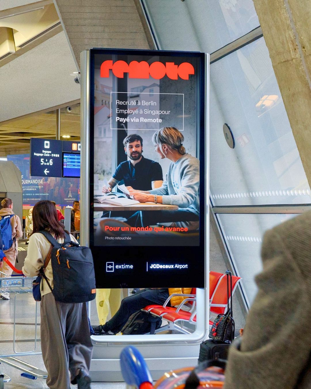
Remote’s new mission and brand, Pay the world, needed to show up in the product, not just on billboards. As a designer on the Compliance team, I helped bring it to the places where customers and their teams handle time, schedules, and compliance every day.
The challenge was to make the product feel like the new Remote without making anyone relearn how it works. These are tools people rely on to get paid correctly and stay compliant, so the redesign had to be calmer and clearer, never a disruption.
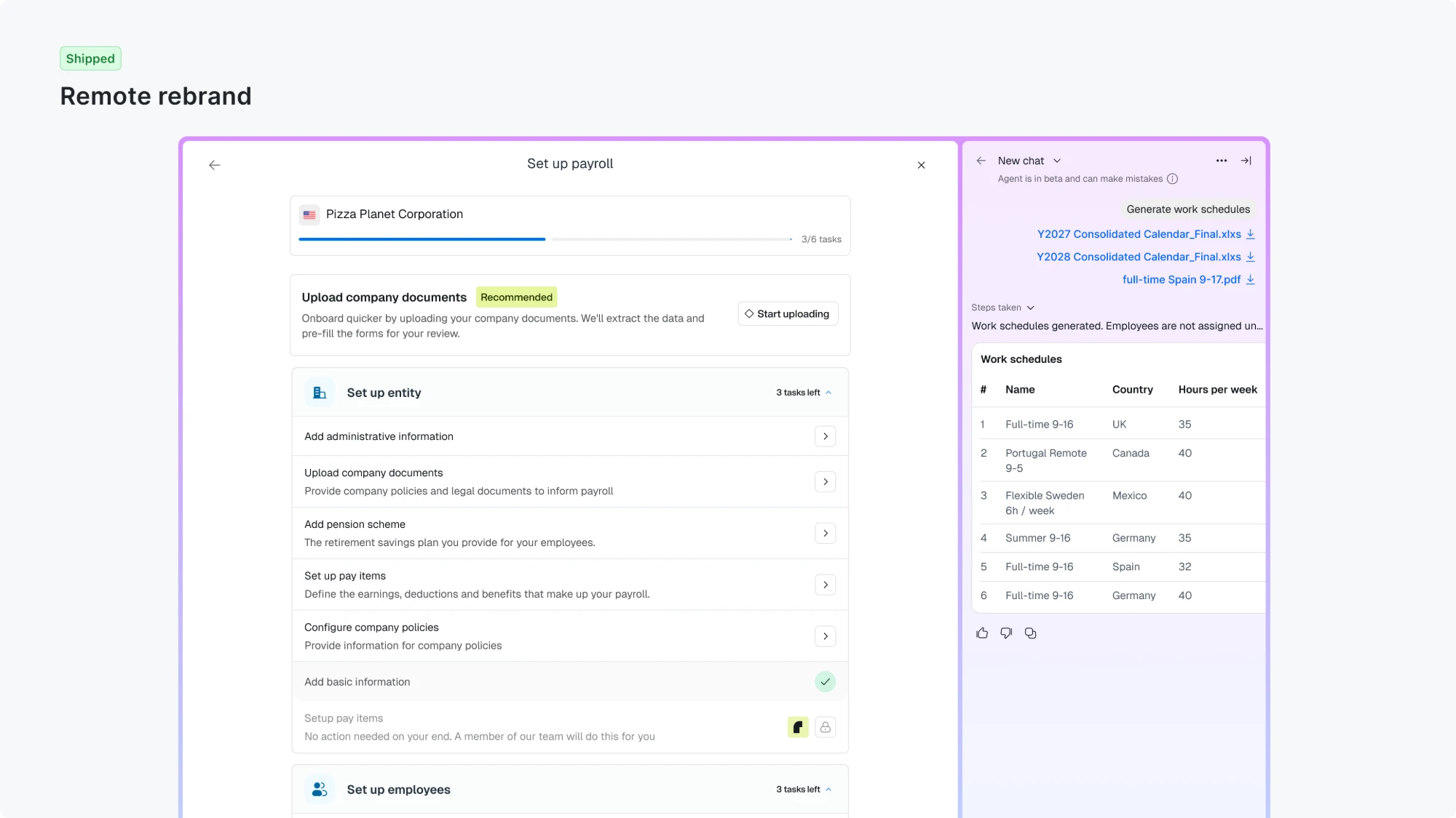
I designed the refreshed screens for Time & Attendance, Work Schedules, and the Compliance Platform, moved them onto the updated design system, and worked with engineering through implementation and cleanup.
What I focused on
- Easier to scan: Less visual clutter and a clearer hierarchy, so the thing a person came to do stands out in timesheets, calendars, and the policy editor.
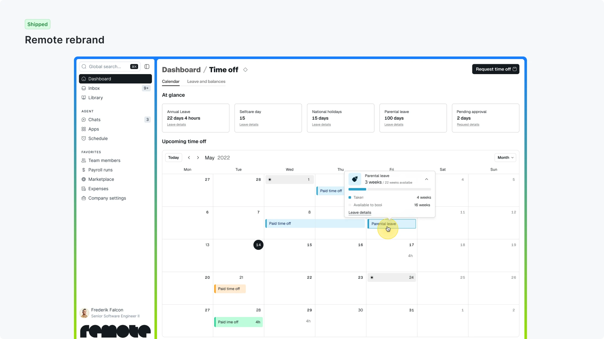
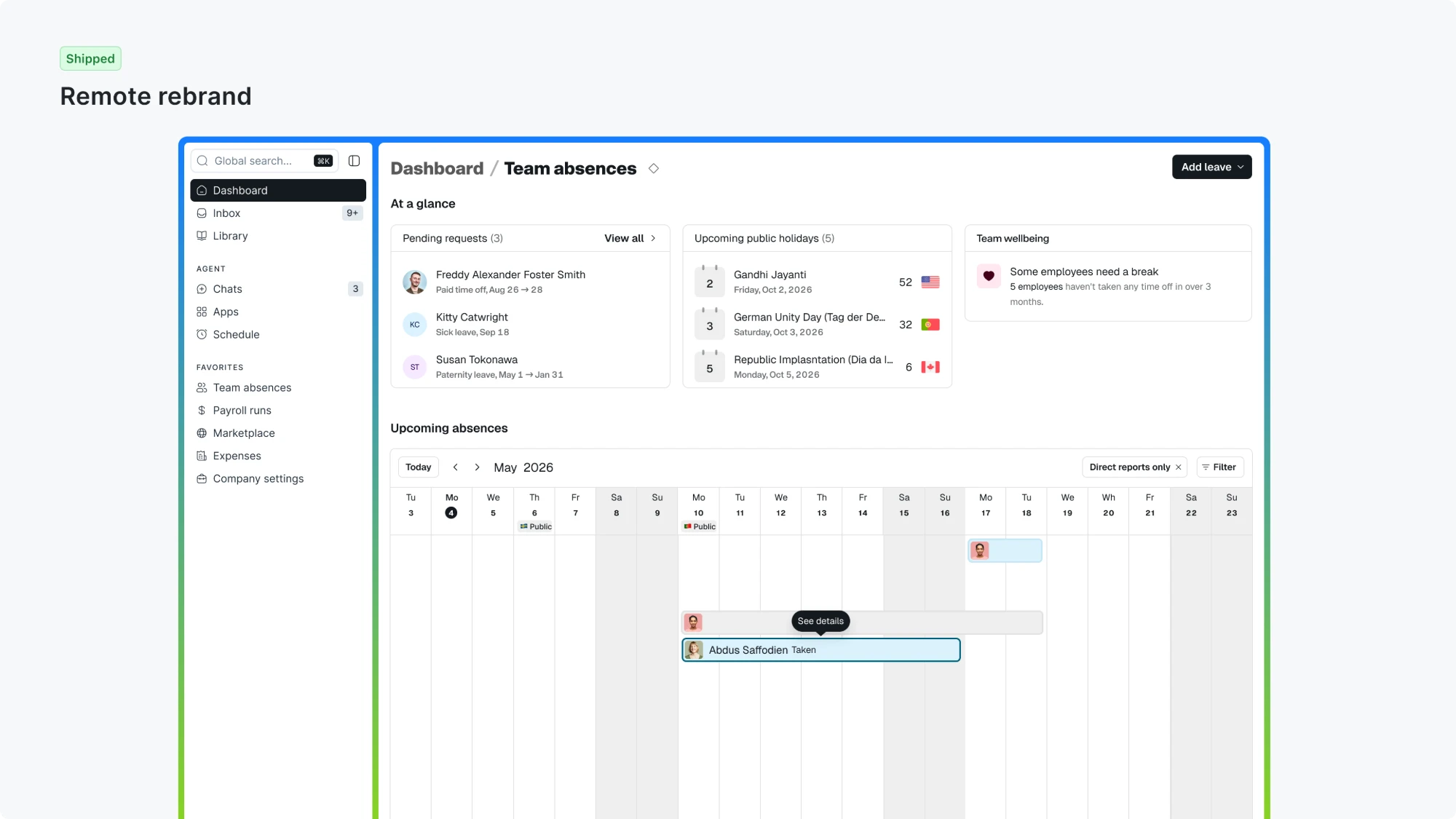
- One consistent product: Time Off, Team Absences, Work Schedules, and the Compliance Platform now share the same patterns and calendar styling, so they feel like one product.
- Plain, accurate language: Work Schedules moved from “fixed/flexible” to “weekly pattern/custom schedule”, with a clear note that schedules don’t determine pay.
- Built to last: Designs rely on semantic design-system tokens instead of one-off values, and legacy styling was removed, so the new look is easier to maintain and evolve.
Gallery





In detail
Time & Attendance
- Timesheets: Simplified with dividers instead of boxes, clearer submission states, and notes shown inline.
- Time Off and Team Absences: Made more consistent, with widgets moved above the calendars and shared, clearer calendar-event styling.
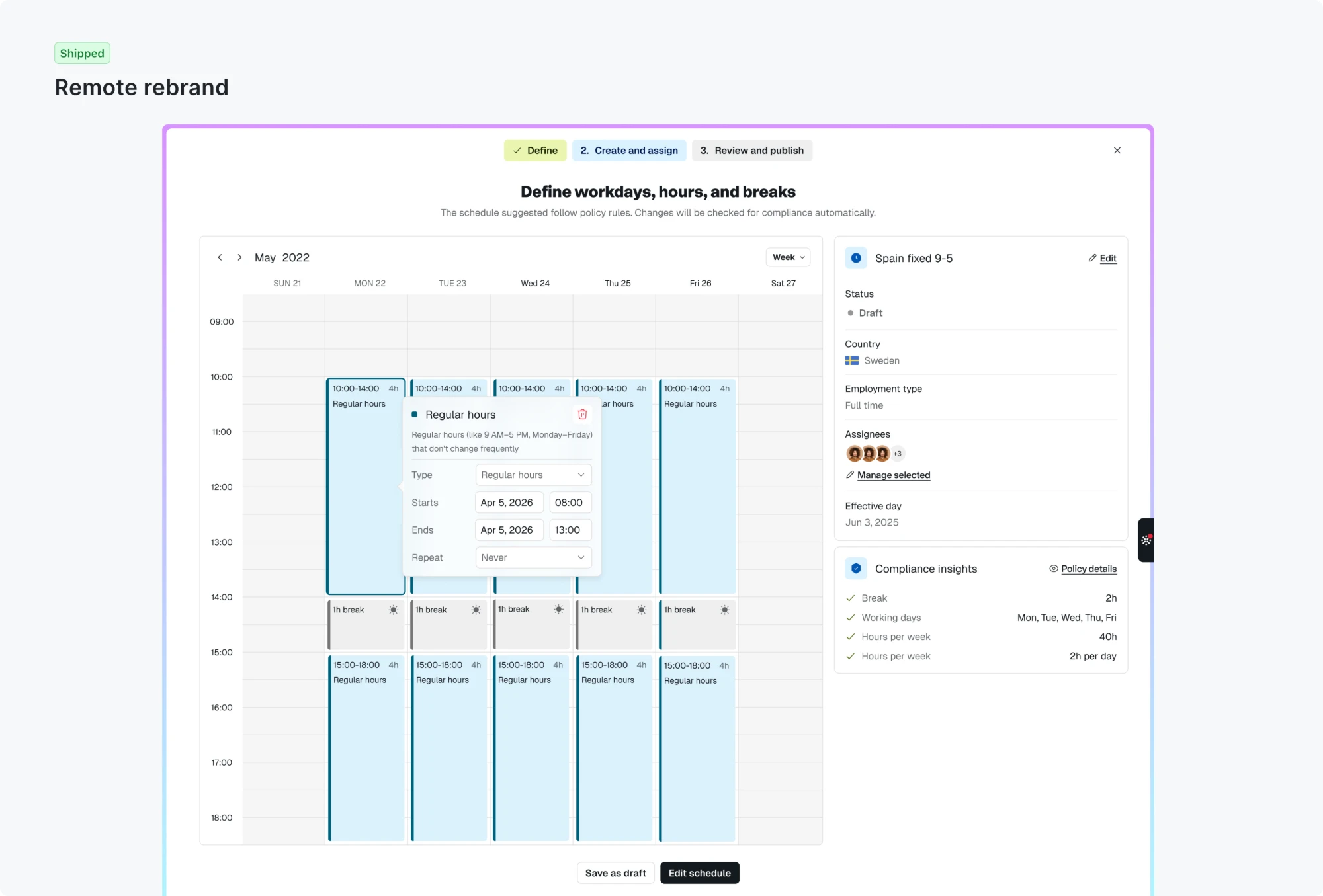
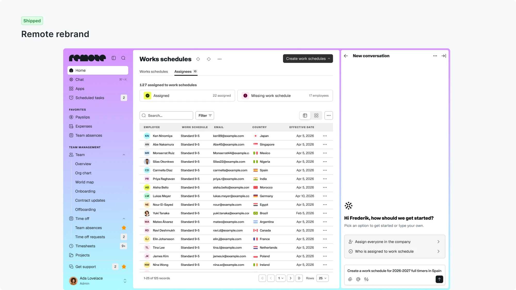
Work Schedules
- Branded as it was built: The new experience was designed with the new brand from the start.
- Language: Shifted from “fixed/flexible” to “weekly pattern/custom schedule”.
- First release: Focused on weekly patterns, with a clear disclaimer that schedules don’t determine pay.
Compliance Platform
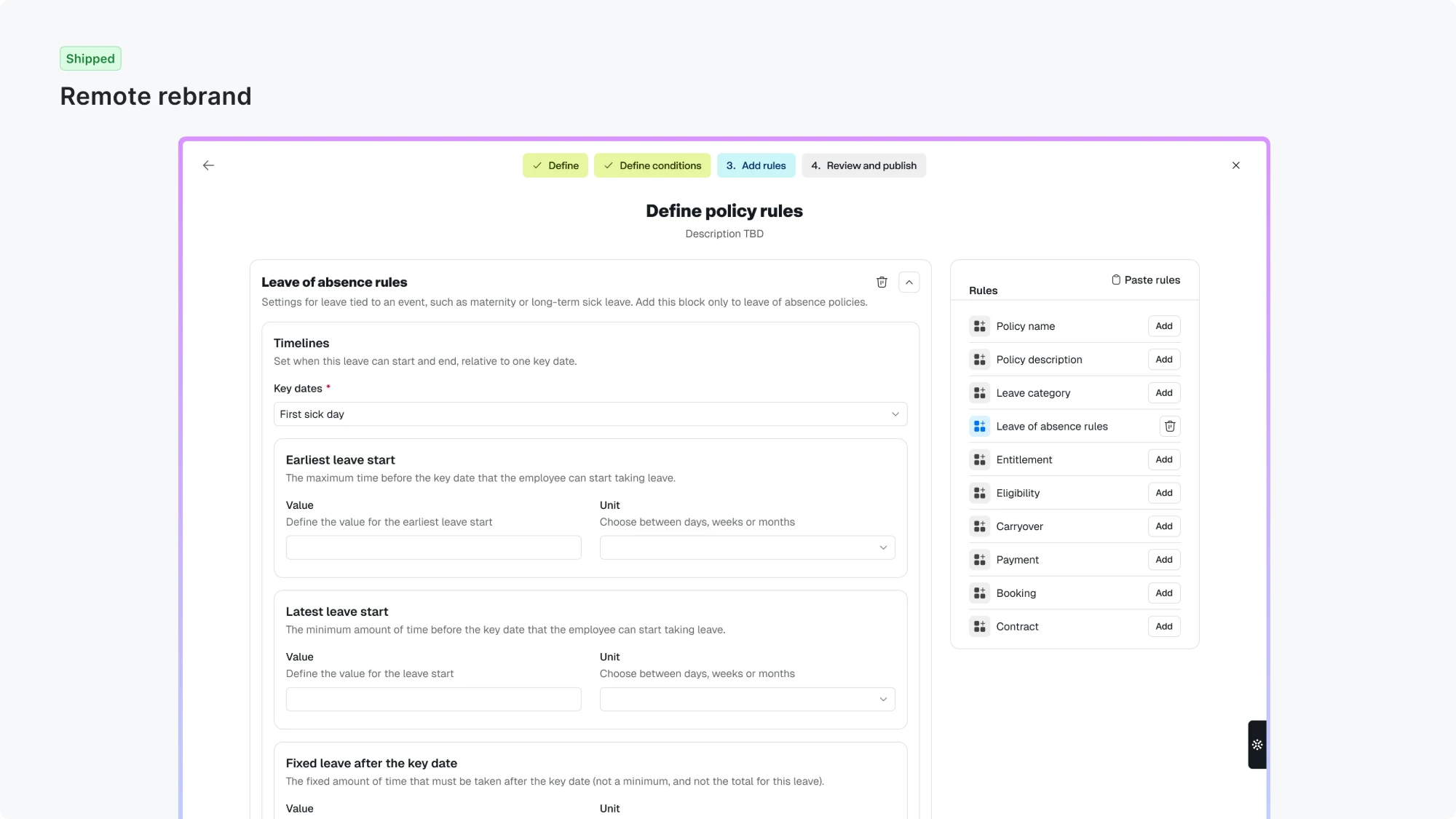
- Admin policy editor: Visual cleanup across its main steps: more consistent cards, spacing and controls, and quieter typography and buttons.
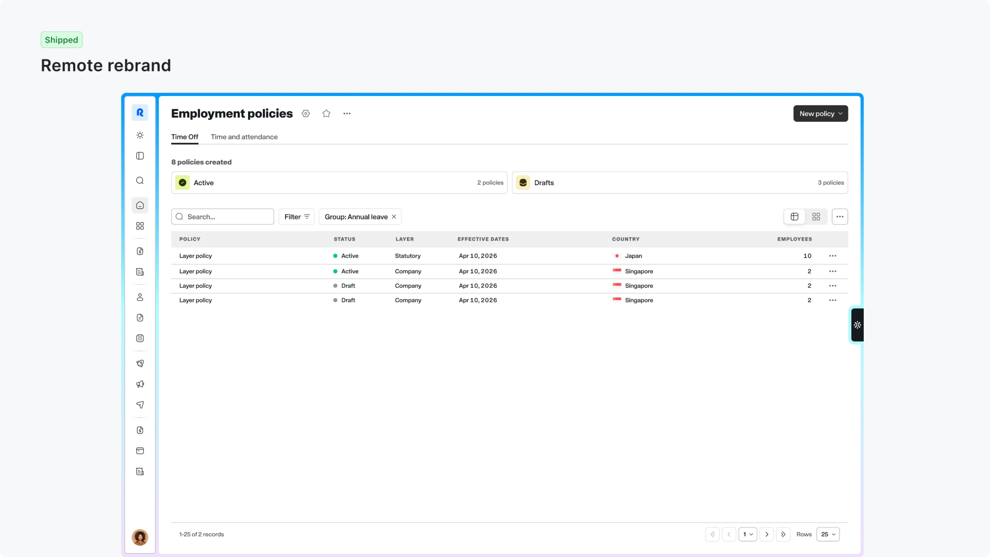
- Policy list and publishing: Clearer policy-status filters and a more polished publish/success screen.
- Follow-up: The nested rule-editor layout was recognized as still boxy and left for a later iteration.
My contribution
The rebrand aligned Time & Attendance, Work Schedules, and the Compliance Platform with the updated design system, focusing on visual consistency and implementation cleanup rather than new functionality.
- Product design: Updated typography, headings, buttons, inputs, cards, and calendar colours. Timesheets gained denser layouts and clearer text/icon hierarchy, and Work Schedules designs were migrated to the new components.
- Design-system tokens: Replaced raw colours and legacy typography with semantic tokens, such as secondary-text colours, fill-subtle backgrounds, and standard body, title, and display styles. Compliance editor remediation also covered spacing, radius, and shared card patterns.
- Code: Engineering implemented the refreshed designs, initially supporting both themes, then removed legacy styling from Work Schedules, Rules Engine, and Time Tracking.